What Actually is Typography?
Typography is the art of arranging letters and text in various combinations of font, size, and spacing in order to make the copy legible, clear, and visually appealing to the reader. Typography includes font style, appearance, and structures, which aim to invoke certain emotions and convey specific messages. Typography is everywhere and brings the text to life. When you see product catalogs, posters, brochures, websites, logos, or anything that has text, it involves the use of typography.
Graphic designers and creatives use typography to adjust the text within the design. The strategic use of typefaces allows the designers to make a design look visually appealing and create content with a purpose. It is important to note that typography is not meant to only be aesthetically pleasing, designers have a certain message to convey to a target audience. They consider some crucial things when using typography. Graphic designers make judicious decisions regarding choice of font, size, body text, white space, placement, and many other aspects of using a typeface.
How Typography is Relevant to Your Brand
Typography design is a form of communication to your target audience. Good typography will establish a strong visual hierarchy, create visual harmony, be test reader-friendly, and set the product’s overall tone. Typography should guide and inform your users, optimize readability and accessibility, and ensure an excellent user experience.
It Conveys a Specific Message
It is important to note that typography is not meant to only be aesthetically pleasing, rather designers have a certain message to convey to a target audience. They consider some crucial things when using typography. Graphic designers make judicious decisions regarding choice of font, size, body text, white space, placement, and many other aspects of using a typeface.

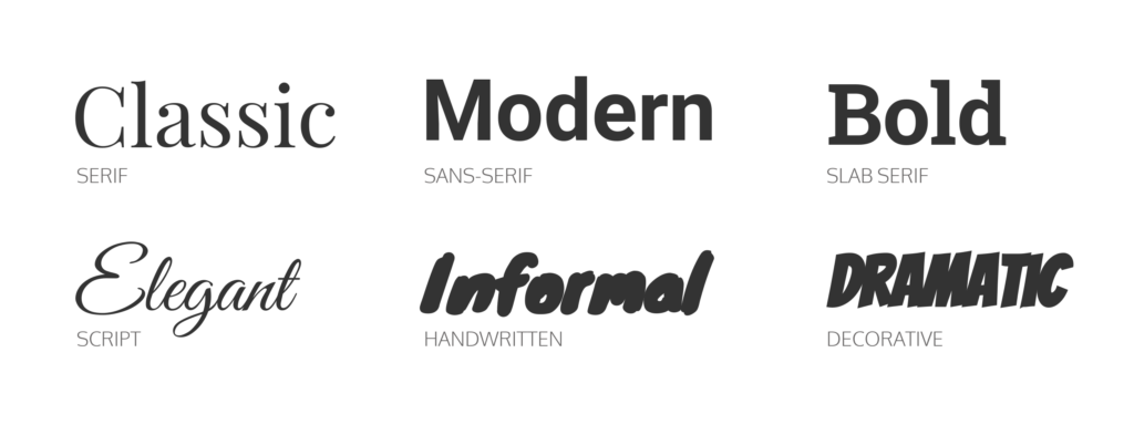
Typography has personality. Remember that various typefaces and fonts carry different characters and meanings. Your design can look friendly, high-end, playful, or welcoming, etc. based on what typefaces you use. Take, for example, sans-serif typefaces. These are typically preferred to give a design or a text page a clean, simple, and easy-to-read look on a large scale. So, these are modern-looking typefaces. On the other hand, serifs are generally considered conventional and old-fashioned. However, they are also easier-to-read typefaces, so they are more preferable for long-form content such as books and blogs.
It Builds Brand Recognition
Careful consideration of your typeface and consistency of use across your designs presents your brand with a kind of rhythm. Typography makes your company special and works as a form of identification for consumers. Brand recognition and brand awareness are crucial for businesses to deal with competition. Fonts used in design are the visuals that your audience will keep in their memory for a long time. Multiple logos are typography-based. Take, for instance, the logos of Google, Disney, CocaCola, and Netflix, and Twitter. These are all great examples of a recognizable typography logo due to their specific use of typefaces.
Ending Note
Typography is a crucial element that uplifts a design and gives it a personality. For designers, typography is a way to use text as a visual to convey a brand message. This design element is important for graphic designers not only to build personality, convey a message but also to grab the viewer’s attention, build a hierarchy, brand recognition, harmony, establish value, and denote the tone of a brand.
If you want to learn more about Typography and how you can start using it, check out our “Typography For Non-Designers” web story!


