When it comes to visual aesthetics, color is one of the first things a person notices. Whether intentional or not, colors give meaning to design. They stir emotions and express values.
Research from the Institute for Color Research reveals people make a subconscious assessment about an environment or product within 90 seconds of initial viewing, and between 62% and 90% of the assessment is based on color alone. It is very important to consider the psychological impacts that color can have on potential customers. Not only does color influence mood and perception, but it can also increase brand recognition by up to 80%. There are many elements to consider when developing a color strategy, such as psychology, culture, trends, and most importantly context. In this blog, we will mainly be focusing on color psychology.
Color Psychology
Color Psychology is what is associated with color is mostly subjective and can vary depending on the person and culture, but some color traits are fairly universal.

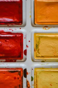
Warm colors such as red, orange, and yellow can evoke feelings of passion, happiness, enthusiasm, energy, and excitement. Such bright colors can also signal danger or aggression. Interestingly enough, red can also increase one’s appetite. Did you know that red is the only color that can cause a measurable physiological reaction in your body, such as increasing your heart rate and blood pressure?
Cool colorslike blue, purple, and green are calming and soothing colors, but they can also evoke a bit of sadness. These colors are usually incorporated into designs that want to showcase health, beauty, or security. Additionally purple and light blue is used to showcase creativity. On the other hand, dark blue is considered to be the color of trust and is used by many financial institutions, healthcare, government organizations, and corporations.
:max_bytes(150000):strip_icc()/UNDERSTANDING_COOLCOLORS_0570-00c3e88ab524496595d959793c79fb30.jpg)
Happy colors are bright and warm such as yellow, orange, and pink. Pastels can also evoke uplifting emotions. Lastly, such colors can also stir up feelings of youth, optimism, and nostalgia.
Sad colors are dark and muted. Grey is majorly known to be the color of sadness, but dark and muted cool colors like blue or green, and neutrals like brown or beige can also evoke similar emotions depending on how they’re used. Black is often considered the color of mourning in Western cultures; however, in some East Asian countries, it’s white. Find out more about colors and culture to come in a future blog.
Calming colorslike blue and green can make you feel peaceful. Neutral colors such as white, beige, and grey can also make you feel calm. Pastel colors and particularly cool-toned pastels like baby blue, lilac, and mint have a calming and relaxing effect. Neutrals like white, beige, and grey can also make you feel calm. The fewer colors you combine and the more simple and pared back a design is, the more calming it will feel.
Energizing colors that are strong, bright, or neon can have a powerful effect on emotions. Colors like bright red, bright yellow, and neon green grab your attention and can make you feel more alert. On the downside, these colors can also be irritating to the eyes. Highly pigmented colors like royal blue, magenta, turquoise, and emerald green can also have a stimulating effect and make you feel energized and refreshed.
Ending Note
Now that we know more about how people perceive color, by keeping these points in mind when creating your nextproduct catalogs, brochures, website, logo, or anything else, you are this much closer to constructing a strong and effective design that communicates the correct purpose. Effective use of color can send a positive or negative message and even incite sales. If you want to further increase your brand’s designs, the next step is to incorporate a strong Typography strategy.Read more about what Typography is and how it is important here!
Check out our web storyColor Crimes To Stay Away From: Color 101for even more color content!


