Let’s be honest — first impressions are everything. And when it comes to your brand, your logo design is often the one making the introduction. It’s the handshake, the elevator pitch, the “Hey, nice to meet you!” all wrapped into one graphic. But a logo isn’t just about looking good — it’s about being good at what it says about you. It’s more than just a pretty symbol — your logo should tell a story, communicate your brand values, and resonate with your target audience.
Whether you’re creating a logo from scratch or giving your current one a well-deserved glow-up, here are a few logo design basics that can help you make a lasting mark — literally.
1. Keep It Simple

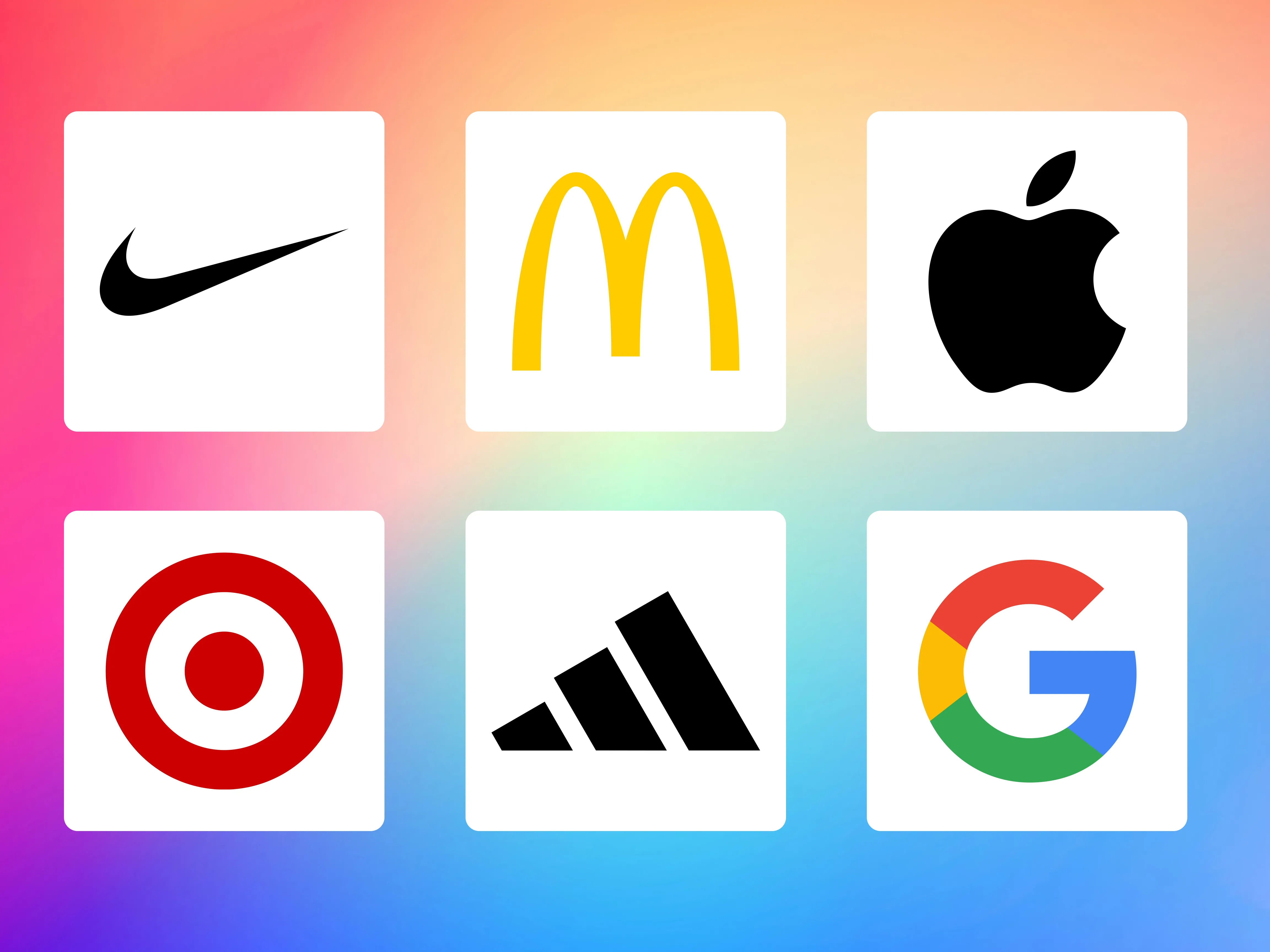
One of the most common mistakes in logo design is overcomplication. We get it. You want your logo to do everything — tell your story, show your personality, and maybe even do a little dance. But resist the urge to overdesign. The best logos are simple, clean, and crystal clear. A simple logo is easier to recognize, more versatile, and more memorable. Think of iconic logos like Nike, Apple, or McDonald’s — they’re instantly recognizable, even at a glance or when scaled down. While their recognition was strengthened by consistent, long-term branding, the foundational design elements were strong enough to stand the test of time.
Pro Tip: Strip your concept down to its essentials. If it still conveys the right message without the extras, you’re on the right track.
2. Design for Versatility
Your logo isn’t just living on your website. It’s going to be splashed across business cards, embroidered on polos, printed on packaging, and maybe even turned into a vinyl decal for your company vehicle. That means it should work in black and white, multiple sizes, and various color situations. Design in vector format (like .AI or .EPS) so it can scale without losing quality. And don’t forget to create variations: full color, black and white, stacked, horizontal, and icon-only. A flexible logo is a future-proof logo.
3. Use Color With Purpose (Not Just Because It’s Pretty)

Colors carry emotional and psychological meaning, which can subtly influence how people feel about your brand. Research from the Institute for Color Research reveals people make a subconscious assessment about a person, environment, or product within 90 seconds of initial viewing, and that between 62% and 90% of that assessment is based on color alone. Whether we realize it or not, colors invoke emotion. For example, warm colors (red, orange, yellow) spark energy and passion but can also signal danger. Red boosts appetite and heart rate. On the opposite end, cool colors (blue, green, purple) are calming and tied to trust, health, and creativity—especially light blue and purple. Dark blue conveys reliability, often used in finance and healthcare.
Limit your palette to two or three strong colors to keep things clean and impactful. Need help selecting the right colors? The Adobe Color Wheel is a great tool for finding harmonious combinations. Read more about Color In Marketing: What Color Can Do For Your Brand in one of my previous blogs.
4. Choose the Right Typography
Typography plays a big role in how your logo is perceived. A bold sans-serif might scream “modern and minimal,” while a classic serif whispers “refined and reliable.” If you’re incorporating custom lettering, make sure it’s legible at all sizes. Avoid overly decorative or trendy fonts that might feel dated in a year or two. The best logos use fonts that support, rather than overpower, the design.
5. Think Long-Term — Not Just What’s Trending
While it can be tempting to follow design trends, remember that your logo should last for years. Design trends are fun, but they’re also fleeting. What feels fresh today might feel dated tomorrow (I’m looking at you, 2017 gradients and overly abstract marks). A timeless logo reflects your brand’s core identity and remains relevant even as styles shift.
When in doubt, test your logo by asking: Will this still work five years from now? Ten?
6. Embrace Negative Space

Negative space — the space around or between design elements — can add a clever, thoughtful layer to your logo. Famous examples like the FedEx arrow or the hidden bear in the Toblerone logo show how subtle design elements can enhance memorability. This technique helps reinforce simplicity and can make your design more engaging. Hidden gems like these make people take a second look — and that second look? That’s a win. So don’t be afraid of white space. Sometimes what’s not there says just as much as what is.
Ending Note
Every brand is different, but the best logos share a few universal traits: they’re simple, versatile, intentional, and built to last. Strong logo design is both an art and a strategy. Great design isn’t just about aesthetics — it’s a business investment. When approached thoughtfully, your logo can become a symbol that customers recognize, trust, and connect with over time.
So if you’re about to design a logo (or redesign one), think strategically. Your future self — and your audience — will thank you.
Need Help With Your Logo Design?
At Corkboard Concepts, we specialize in branding that makes an impact — from logos and websites to fully integrated campaigns. Whether you’re starting fresh or ready for a brand refresh, we’re here to help. Contact us today to get started on your next design project!
Check out some of our other blogs for more awesome inspiration and knowledge for creatives. Here are some recommendations to get you started!
Branding:
3 Tips for Better Usage of Your Brand’s Creative
Design:
Top Elements for Interactive Web Design
7 Dont’s in Web Design and Development
Top 7 Digital Display Ad Design Tips
Inspiration/Tips:


