With the world of design and marketing stepping more and more into the digital age, it is almost a necessity to have an amazing website for your consumers to visit. There are numerous different approaches and styles that your website can go in when it comes to website design. It could be modern, playful, bold, elegant, or simplistic. The possibilities are truly endless.
With so many options available, where do you even begin? Well, first off, your website should radiate your company’s personality, brand identity, and type of work. There are also some ground rules or key tips you should follow when building out your website. User experience, functionality, and ease of use are essential components of a great website. Let’s dive into some design tips for a great website. This will help make your website more appealing and effective!
6 Design Tips For A Great Website
1. Navigation Made Easy
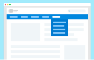
One of our first design tips for a great website is making navigation easy. Easy-to-use navigation is key to keeping people on your website. Your navigation is meant to be a map to guide users deeper into your website to find out more about your company, services, products, blogs, etc… However, nothing is more frustrating than visiting a company’s website and then seeing disorganized or confusing navigation. If users cannot find what they are looking for on your website they are one click away from leaving and finding a better user experience offered by one of your competitors.

Here are some tips to keep in mind:
- Link your logo to the Home page. This is pretty common practice on websites when the logo is placed in the header and the footer.
- Use clear simplified labels and limit your top navigation to a maximum of about 7 main choices. Then create sub-navigations with clear categorization. Fun fact: Did you know that the average human can only remember about 7 items at a time?
- Include navigation options in your footer. Visitors expect to find navigation options and contact information here. This may also be a good place to add any social media icons or other relevant links that visitors may need.
2. Less Is More
It is a known behavior that people quickly scan content and rarely read every word when looking through a website. They pick out keywords, sentences, and images. The fewer users have to read, click on, or remember, the better they’ll be able to process and evaluate your content.
Here are some tips to keep in mind:
- Keep any important content above the fold. “Above the fold” means the area at the top of your website before scrolling down. Your visitors should instantly be able to understand what your website is about without ever having to click or navigate anywhere else.
- Keep your text content in check. Make sure the text on the website is relevant and easy to comprehend. It would be best to write for all levels of readers by avoiding fancy jargon and picking easily understandable words for everybody.
- Avoid giant walls of text. Group your information into sections and break them up by using headers or bulletpoint to make it easier to digest visually.
3. Typography
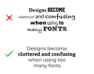
With several thousand different typefaces available, it is tempting to want to use 5 or 6 of them when designing a website. You should do your best to resist that temptation though since too many font variations can look messy, create confusion, and make content difficult or annoying to read. A maximum of 3 typefaces is what is commonly recommended.

Print and Web are not the same. That seems pretty obvious, but a lot of people treat them as if they were the same. With that in mind, not all print rules apply (like widows and orphans). Print is fixed, and the Web is dynamic. If you have a properly responsive website, it is impossible to have complete control over how your Web design will look for everyone. More to come about responsiveness later on. Learn more about Typography in our blog here.
4. Colors
Similar to typefaces, it’s better to avoid using too many colors in your design. Using too many colors is like trying to convey a million feelings and messages at once, which can confuse the person viewing your website. Unless you want to highlight a specific important section with another color, it is always better to limit your color scheme and pick only a few to consistently use across your website.
In addition to keeping your brand’s colors in mind, maybe take a moment to think about what message you want to convey with your color choices. For example, if you are a serious business-oriented company, you wouldn’t typically choose a loud and bright pink. If you would like to learn more about How Color Gives Meaning To Design, click the link to read our related blog.
5. Whitespace Used Properly
Whitespace, also known as “negative space,” refers to the areas around elements on a page that are empty and lacking content or visual items. Empty space may sound unappealing at first and many new designers make the mistake of filling up every nook and cranny of a design. However, whitespace can add class, break up a page, increase readability, and create some breathing room for pages with heavy amounts of content. Adding whitespace can help guide your users to focus on each part of a website page piece by piece or even to add emphasis to important sections. Remember point 2, less is more.
6. Responsiveness

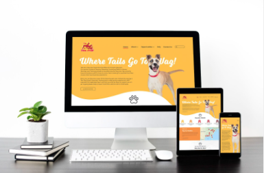
Perhaps one of the most important points is making sure your website is responsive. Your website’s visitors can be using a computer, tablet, phone, gaming system, or even a watch. It is important to ensure that no matter what your visitors are using to view your website, they can still see any and all vital information correctly on different screen sizes. 80% of internet users own a smartphone, so it is critical that your website be optimized for mobile too.
Typically, mobile websites have less clutter and are cleaner than their desktop counterpart. It may even be helpful to build your website starting with the mobile design first. Then you can build out and add elements to the desktop design based on the simpler mobile layout. Learn more about responsive design in our blog here.
Ending Note
With us coming to the end of my website design tips, my last suggestion is that you take the time to read up on some of the latest web design trends and gain inspiration by looking at other people’s websites. There is a lot to learn from seeing designs in action afterall. After implementing all of these tips on your website, you will be able to see an improvement in performance, customer satisfaction, experience, and customer conversion rates.
Interested in the Website Design and Development Process? Click the link to find out more


